
The Origin Story Behind the New Wordmark
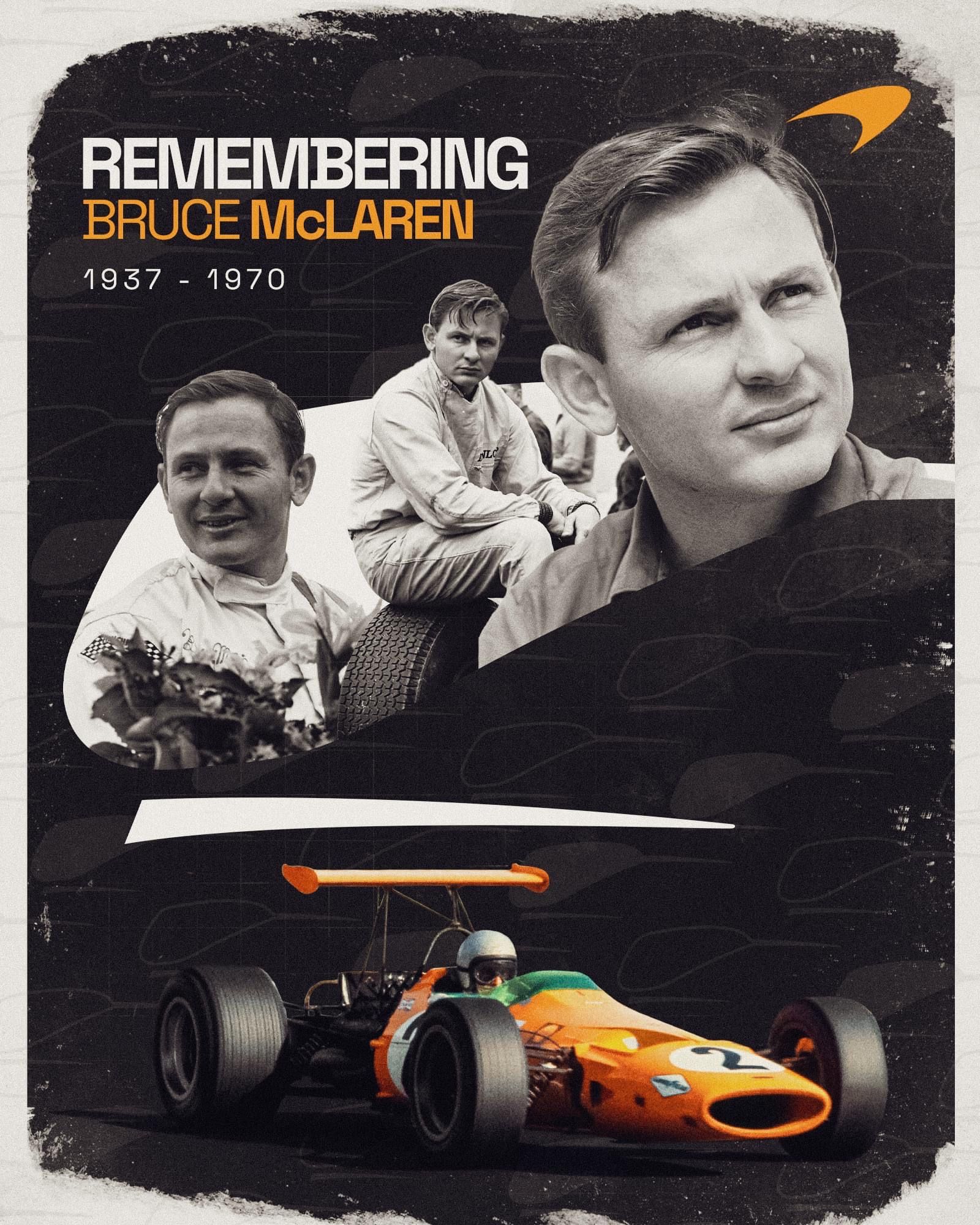
Bruce McLaren’s story is one of motorsport’s great origin tales. Before he was a Formula 1 race winner, a Le Mans champion, and the namesake of one of the world’s most revered performance brands, he was a kid hanging around his family’s service station in Auckland. That station, run by his parents, is where his career effectively began. The car he won his first race in was reportedly built right there on the premises.
The sign above that station featured hand-painted letterforms, unassuming and workmanlike, the kind of typography you would expect on a mid-century fuel stop rather than a modern supercar marque. McLaren’s design team looked at those letters and saw something worth reviving. The new wordmark draws directly from that sign, translating its character into a modern identity that carries the weight of where the company came from.
It is a smart piece of storytelling. Plenty of brands claim to honor their heritage. Fewer can point to a literal piece of signage from the founder’s childhood and say, that is where this came from.
McLaren’s New Logo: What’s Changing and What’s Staying
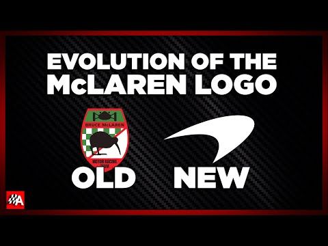
A rebrand this significant could easily have thrown out the baby with the bathwater, but McLaren has been careful to preserve the symbols that fans actually recognize.
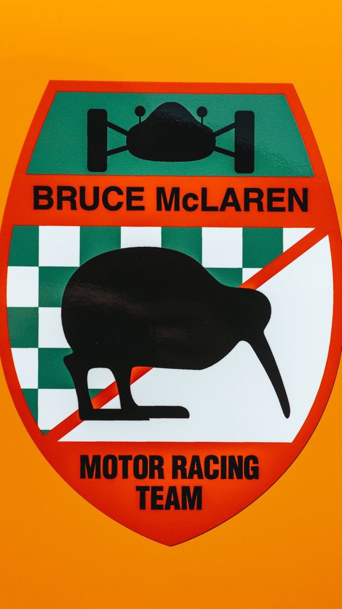
The Speedmark, that stretched-moon badge you see on the nose of every McLaren road car, remains. So does Papaya Orange, the color that has become synonymous with the brand’s racing identity. The McLaren Heritage Shield, rooted in Bruce McLaren’s New Zealand origins, stays in the family. And the Speedy Kiwi, a charming nod to the founder’s homeland, is not going anywhere either.
That continuity matters. McLaren’s visual identity has always been a mix of high-tech precision and genuine personality, and the Speedy Kiwi is perhaps the purest expression of the latter. Losing it in pursuit of a sleeker image would have been a mistake.
McLaren Sans: The New Typeface Explained
Alongside the new wordmark, McLaren developed a bespoke typeface called McLaren Sans. The letterforms are related to the new wordmark, giving the brand a consistent typographic voice across everything from car badges to team kit to digital platforms.
The color palette also comes with narrative depth. Papaya traces back to Bruce McLaren’s practical decision to paint his cars in a shade that made them easy to spot on track. Ember draws from the racing suits worn during that era. Midnight references a blue from McLaren’s earliest years, a color that predates the papaya era and speaks to the company’s roots in a different register.
These are not arbitrary choices pulled from a mood board. Each one has a story, and together they form a palette that spans McLaren’s entire history rather than just its most famous chapter.
The Scope of the Rebrand
This is not simply a supercar division refresh. The new identity will roll out across the entire McLaren automotive dynasty, from Formula 1 to IndyCar to the World Endurance Championship, where it will appear on team kit, merchandise, and liveries come 2027.
It will also show up in physical badge form on future road cars, including the SUV that McLaren has now confirmed it is developing. Newly edited images have already shown the script on the back of the 6GT, replacing the previous “McL 6GT” branding, which gives a clear sense of how the wordmark will sit on a real car.
For a company that competes in so many different arenas, a unified visual identity makes practical sense. It also reinforces the idea that McLaren is one brand, not a collection of loosely related racing programs and a car company.
McLaren SUV: What We Know So Far
The rebrand lands during a busy period for McLaren. The company recently debuted the stick-shift MCL-6GT at Monterey Car Week, a car that generated genuine excitement among enthusiasts. It has also announced a more than $600 million investment in the McLaren Technology Centre in Woking, England, signaling serious long-term commitment to its home base.
And then there is the SUV. McLaren’s first-ever SUV is officially in development, a decision that will undoubtedly prompt debate among purists but makes commercial sense in a market where high-riding performance models are highly profitable. The new wordmark will almost certainly appear on it, which means the service station sign from Auckland will end up on the back of a family-hauling performance vehicle. There is something delightfully strange about that lineage.
Reception and Aspirations
Not everyone has been won over. Some critics have suggested the new logo looks more like branding for a luxury fashion house, a hotel chain, or a skincare manufacturer than a race team. The critique reflects a perception that the wordmark leans elegant and understated rather than aggressive and technical.
One thing worth noting: the logo is definitively not AI-generated. That clarification matters in a moment when AI-generated design has become a genuine concern across the creative industries, and audiences have grown wary of logos that lack a human hand behind them.
McLaren, for its part, has bigger ambitions than winning a logo debate. The company has stated its aspiration to complete motorsport’s Triple Crown again, winning the Monaco Grand Prix, the Indianapolis 500, and the 24 Hours of Le Mans. That is a monumental goal. For a manufacturer to pursue it across its various programs is a statement of intent.
Balancing Heritage and Modernity
Rebrands are always a gamble. Lean too hard into heritage and you look stuck in the past. Chase modernity too aggressively and you alienate the people who built your brand’s meaning in the first place.
McLaren’s new identity attempts to split that difference by grounding its most visible change, the wordmark, in the most personal part of its origin story. The service station sign is not a marketing invention. It is a real artifact from the life of a man who built race cars and drove them faster than almost anyone of his era.
Whether the new look wins over skeptics will depend largely on how it looks on a Formula 1 car at speed, on a Le Mans prototype in the dark, and on the tailgate of an SUV in a school drop-off line. But the intent behind it is clear. McLaren wants to remind everyone that before it was a technology company, a supercar manufacturer, or a global racing empire, it was a kid in a garage in New Zealand with a sign his parents painted above the door.
That is a story worth telling, and a logo worth putting on a car.



One Comment